
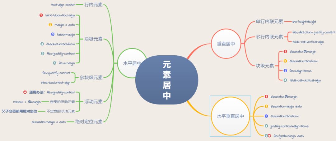
本文主要介绍水平居中,垂直居中,还有水平垂直居中各种办法,思维导图如下:
水平居中
1.行内元素水平居中
利用 text-align: center 可以实现在块级元素内部的行内元素水平居中。此方法对inline、inline-block、inline-table和inline-flex元素水平居中都有效。
1   .parent{//在父容器设置
2        text-align:center;
3    }
此外,如果块级元素内部包着也是一个块级元素,我们可以先将其由块级元素改变为行内块元素,再通过设置行内块元素居中以达到水平居中。
 1<div class="parent">
 2  <div class="child">Demo</div>
 3</div>
 4<style>
 5  .parent{
 6    text-align:center;
 7  }
 8  .child {
 9    display: inline-block;
10  }
11</style>
2.块级元素的水平居中
这种情形可以有多种实现方式,下面我们详细介绍:
①margin:0 auto
1.child{
2    width: 100px;//确保该块级元素定宽
3    margin:0 auto;
4}
②使用table+margin
先将子元素设置为块级表格来显示(类似),再将其设置水平居中
display:table在表现上类似block元素,但是宽度为内容宽。
1<div class="parent">
2  <div class="child">Demo</div>
3</div>
4<style>
5  .child {
6    display: table;
7    margin: 0 auto;
8  }
9</style>
③使用absolute+transform
先将父元素设置为相对定位,再将子元素设置为绝对定位,向右移动子元素,移动距离为父容器的一半,最后通过向左移动子元素的一半宽度以达到水平居中。
 1<div class="parent">
 2  <div class="child">Demo</div>
 3</div>
 4<style>
 5  .child {
 6    position:absolute;
 7    left:50%;
 8    transform:translateX(-50%);
 9  }
10  .parent {
11    position:relative;
12  }
13</style>
不过transform属于css3内容,兼容性存在一定问题,高版本浏览器需要添加一些前缀。
④使用flex+justify-content
通过CSS3中的布局利器flex中的justify-content属性来达到水平居中。
1<div class="parent">
2  <div class="child">Demo</div>
3</div>
4<style>
5  .parent {
6    display: flex;
7    justify-content:center;
8  }
9</style>
⑤使用flex+margin
通过flex将父容器设置为为Flex布局,再设置子元素居中。
 1<div class="parent">
 2  <div class="child">Demo</div>
 3</div>
 4<style>
 5  .parent {
 6    display: flex;
 7  }
 8  .child {
 9    margin:0 auto;
10  }
11</style>
3.多块级元素水平居中
①利用flex布局
利用弹性布局(flex),实现水平居中,其中justify-content 用于设置弹性盒子元素在主轴(默认横轴)方向上的对齐方式,本例中设置子元素水平居中显示。
1 #container {
2    display: flex;
3    justify-content: center;
4}
源代码演示
②利用inline-block
将要水平排列的块状元素设为display:inline-block,然后在父级元素上设置text-align:center,达到与上面的行内元素的水平居中一样的效果。
1.container {
2text-align: center;
3}
4.inline-block {
5display: inline-block;
6}
源代码演示
4.浮动元素水平居中①定宽的非浮动元素
通过子元素设置relative + 负margin,原理见下图:
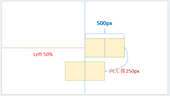
注意:样式设置在浮动元素本身
1.child {
2   position:relative;
3   left:50%;
4   margin-left:-250px;
5}
6<div class="parent">
7  <span class="child" style="float: left;width: 500px;">我是要居中的浮动元素
8
②不定宽的浮动元素
通过父子容器都相对定位,偏移位移见下图:
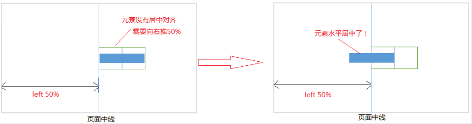
注意:要清除浮动,给外部元素加上float。这里的父元素就是外部元素
 1<div class="box">
 2    我是浮动的
 3    我也是居中的
 4
5.box{
6 float:left;
7 position:relative;
8 left:50%;
9}
10p{
11 float:left;
12 position:relative;
13 right:50%;
14}
③通用办法flex布局(不管是定宽还是不定宽)
利用弹性布局(flex)的justify-content属性,实现水平居中。
 1.parent {
 2    display:flex;
 3    justify-content:center;
 4}
 5.chlid{
 6    float: left;
 7    width: 200px;//有无宽度不影响居中
 8}
 9<div class="parent">
10  <span class="chlid">我是要居中的浮动元素
11
5.绝对定位元素水平居中
这种方式非常独特,通过子元素绝对定位,外加margin: 0 auto来实现。
 1<div class="parent">
 2    让绝对定位的元素水平居中对齐。
 3