

电商用的优惠券一般都带有内圆角样式,实现方式也有很多种:
之前也用径向渐变做过类似的圆角,但是一直对其原理不是很明白,这次又遇到优惠券需求,看到别人制作的一个背景渐变的 demo 很不错,看了一下就明白了实现原理。
矩形斜切角
利用了 css 的线性渐变 linear-gradient 样式,线性渐变其实就是沿着一条直线分布你设置的颜色值,实现斜切角实际上就是把角度正好设置在对折线上(也就是 135° 、45°上),让渐变沿着对折线分布。
要切掉角上的颜色,其实也就是设置成透明 transparent 就行了,颜色本来也就有 transparent 这个色值属性,然后再根据斜切角大小设置一个大小,因为透明了,所以视觉上看着被切掉了。
颜色值后面跟着的 0 代表取消渐变,也就是纯色,如果不加0默认就是你设置的颜色到白色 #FFF 的一个渐变。 background-size: 50% 50% 代表每一块渐变所占的大小,都50%也就是4等份。
线性渐变
样式说明
第一个参数是角度,沿对角线所以这里是135度。
后面跟颜色值,颜色值后面还可以跟具体的位置,可以是百分比,也可以是具体的 px 像素值,如果设为 0,就是接着前面一个的位置,效果就是没有渐变效果,颜色从当前位置直接过渡了,如上面的 red 30% 也可以写成 red 0。
最后面的两个参数分别是 Y轴 和 X轴上的对齐方式,可以设置成 topbottomleftrightcenter 关键字、px像素或百分比,不设置默认就是从左上角的 0 0 坐标点开始对齐。
长和宽大小,也可以 cover、contain,就是定义怎么平铺在盒子里,一般设置背景图常用到
是否重复
矩形斜切内圆角
明白了上面的线性渐变,其实也就很容易理解径向渐变了,径向鉴定就是从一个圆心出发沿着半径渐变,渐变颜色也是以圆形的方式向外分布,那我们将角上的那块渐变色也设置为透明,不就模拟出了内圆角了吗。
径向渐变
径向渐变大部分和线性渐变是一样的,只不过渐变轴是从圆心沿着半径向外去渐变。
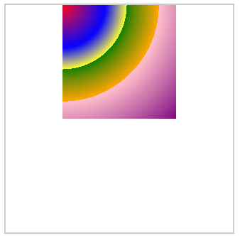
样式说明
background: radial-gradient(circle at top left, red 0%, blue 30px, yellow 40%, green 0, orange 60%, pink 0, purple) top center;
第一个参数 circle at top left 用来指定圆形,如果不指定就是默认从圆心来渐变。
内圆角优惠券效果
下面就是用内圆角实现的优惠券 demo,外面四个角上的外圆角直接给 item 设置 border-radius 就行了,还有在部分设备或布局上 background-size: 50% 50% 可能中间会出现细小的白色空隙,只要将其中一个改大点超过 50% 就能解决了:background-size: 60% 50%。
简洁移动端优惠券

左右布局,中间虚线分割,分割处上下有个内凹半圆,也是很常见的移动端优惠券布局:
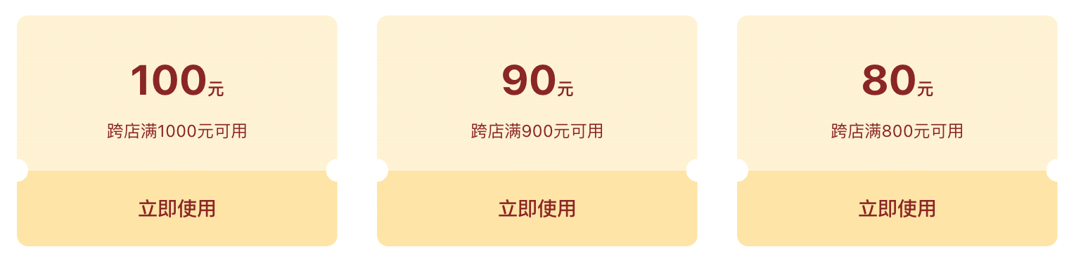
      满减券
      双十一跨店满减
      优惠封顶50元,领完即止,先到先得,快叫上你的小伙伴来领取吧
      2022-04-09至2022-08-05


      100元
      优惠封顶50元
      去使用


  export default {
    name: 'CouponItem',
    props: {
      item: {
        type: Object,
        default: () => ({})
      },
    },
    data() {
      return {}
    },
    methods: {}
  }


$radialGradient($positon = 'right')
  if $positon == 'right'
    background radial-gradient(circle at top left, #FFF, #FFF 0) top left,
    radial-gradient(circle at top right, transparent 10rpx, #FFF 0) top right,
    radial-gradient(circle at bottom right, transparent 10rpx, #FFF 0) bottom right,
    radial-gradient(circle at bottom left, #FFF, #FFF 0) bottom left
  if $positon == 'left'
    background radial-gradient(circle at top left, transparent 10rpx, #FFF 0) top left,
    radial-gradient(circle at top right, #FFF, #FFF 0) top right,
    radial-gradient(circle at bottom right, #FFF, #FFF 0) bottom right,
    radial-gradient(circle at bottom left, transparent 10rpx, #FFF 0) bottom left
  background-size 52% 52%
  background-repeat no-repeat
.coupon-item
  border-radius 20rpx
  overflow hidden
  margin-bottom 20rpx
  display flex
  justify-content space-between
  &.disabled
    .coupon-item-l,
    .coupon-item-r
      opacity 0.6
    .coupon-item-l .tag
      background #C1C1C1
      color #FFF
    .coupon-item-r .price
      color #666
  .coupon-item-l
    $radialGradient('right')
    padding 36rpx 32rpx
    font-size 24rpx
    color #999999
    line-height 36rpx
    position relative
    flex 1
    &::after
      content ''
      border-left 1px dashed #D8D8D8
      position absolute
      right 0
      top 20rpx
      bottom 20rpx
    .tag
      position absolute
      top 0
      left 0
      min-width 100rpx
      font-size 20rpx
      padding 0 20rpx
      line-height 30rpx
      color #8A2626
      text-align center
      background #FFEAE7
      box-sizing border-box
      border-radius 16rpx 0 16rpx 0
    .c-name
      font-size 32rpx
      color $black
      line-height 46rpx
    p
      &:not(:first-child)
        margin-top 8rpx
  .coupon-item-r
    width 226rpx
    padding 36rpx 22rpx
    box-sizing border-box
    text-align center
    font-size 22rpx
    color #999999
    line-height 33rpx
    display flex
    flex-direction column
    justify-content center
    flex-shrink 0
    $radialGradient('left')
    .price
      font-size 60rpx
      color #FC3A17
      line-height 1
      .unit
        font-size 28rpx
    .btn
      font-size 28rpx
      color #161718
      line-height 52rpx
      background linear-gradient(176deg, #FEDD75 0%, #FDC837 100%)
      border-radius 27rpx
      width 156rpx
      margin 11rpx auto 0
      border 2rpx solid transparent
      &.active
        background #FFFCE6
        border 2rpx solid #FDD664
        color #2B2C32
        justify-content center
        .img
          width 38rpx
          height 38rpx !important
          margin-right 7rpx
PC端双边内凹半圆波浪纹优惠券
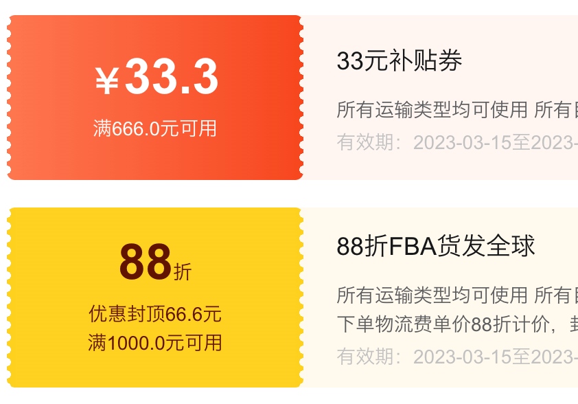
左右布局,一边背景的双侧是内凹半圆波浪纹:
        100元
        跨店每满300减40哟


        双十一满减券
        优惠封顶50元,领完即止,先到先得,快叫上你的小伙伴来领取吧
        有效期:2022-04-09至2022-08-05


        去使用


  export default {
    name: 'CouponItem',
    data() {
      return {}
    },
    methods: {}
  }


$gradient-start = #FE754E
$gradient-end = #F8481F
.coupon-item
  display flex
  border-radius 6px 12px 12px 6px
  overflow hidden
  min-height 120px
  &-left
    width 216px
    padding 0 6px
    border-radius 6px
    overflow hidden
    .coupon-item-inner
      background linear-gradient(to right, $gradient-start, $gradient-end)
      padding 10px
      height 100%
      color #FFF
      text-align center
      display flex
      flex-direction column
      justify-content center
      align-items center
      position relative
      &:before
        content ''
        position absolute
        left -6px
        top 0
        bottom 0
        width 6px
        background radial-gradient(6px circle at 0 50%, transparent, transparent 3px, $gradient-start 3px)
        background-repeat repeat-y
        background-size 12px 9px
        background-position 0 0
      &:after
        content ''
        position absolute
        right -6px
        top 0
        bottom 0
        width 6px
        background radial-gradient(6px circle, transparent, transparent 3px, $gradient-end 3px)
        background-repeat repeat-y
        background-size 12px 9px
        background-position 0 0
      .coupon-item-num
        font-size 36px
        font-weight bold
        line-height 1
        .coupon-item-unit
          font-size 14px
          font-weight normal
      .coupon-item-condition
        font-size 14px
        font-weight 400
        line-height 1.5
        &:nth-of-type(1)
          margin-top 10px
  &-right
    flex 1
    // height 100%
    padding 15px 30px
    display flex
    align-items center
    justify-content space-between
    background #fff5f2
    margin-left -6px
    .coupon-item-info
      .coupon-item-title
        font-size 18px
        color #161718
        line-height 1.5
        margin-bottom 12px
      .coupon-item-des
        font-size 14px
        color #5B5C5D
        line-height 1.5
      .coupon-item-date
        font-size 14px
        font-weight 400
        color #C1C1C1
        line-height 1
        margin-top 6px
    .coupon-item-action
      margin-left 20px
      .coupon-item-btn
        flex-shrink 0
        width 120px
        height 48px
        background #FC331C
        border-radius 24px
        font-size 16px
        font-weight bold
        color #FFFFFF
        line-height 48px
        text-align center
        cursor pointer
参考资料
限 时 特 惠: 本站每日持续更新海量各大内部创业教程,一年会员只需98元,全站资源免费下载 点击查看详情
站 长 微 信: lzxmw777